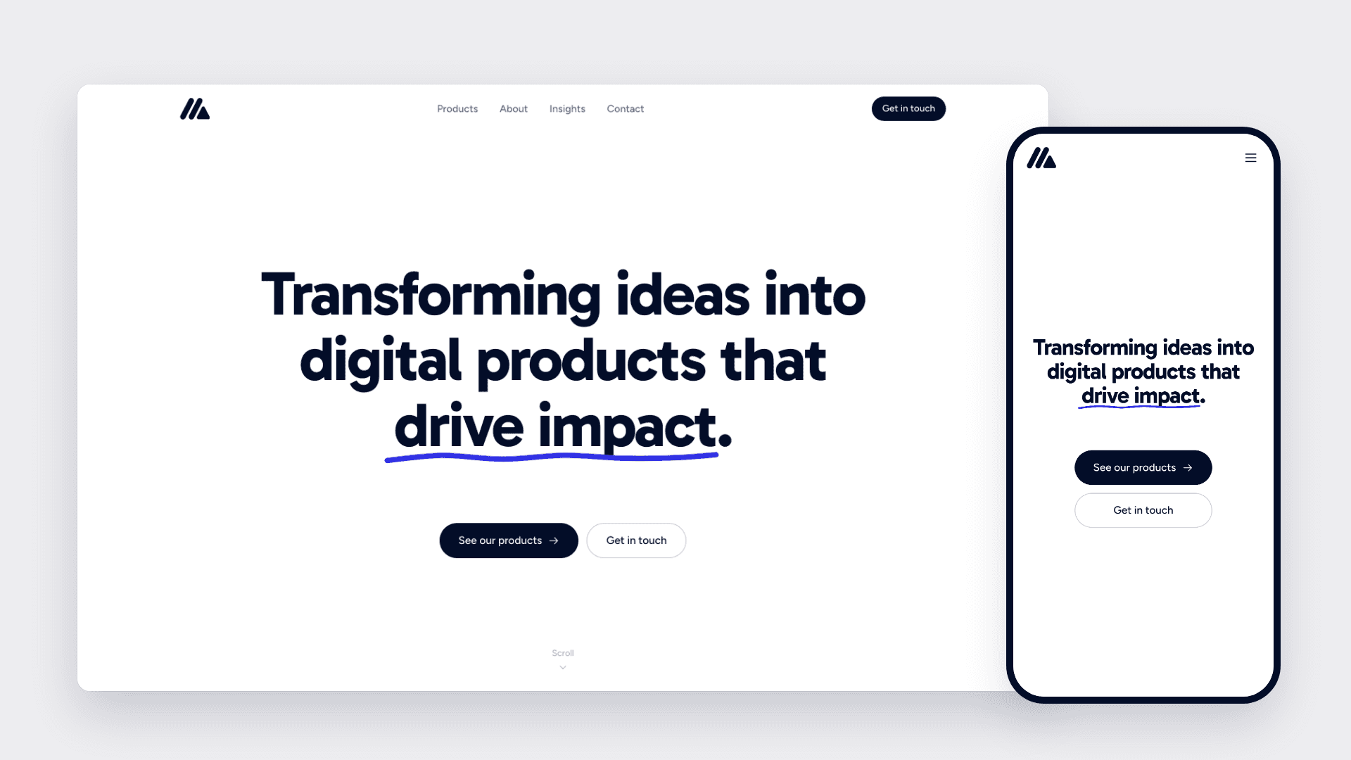
Mavis Digital Website
Mavis Digital is the Malaysian company behind Foodpoint and VidFlo. I designed its corporate website and directed the build within 2 weeks, from an empty Next.js project to the live site at mavis.com.my. I owned the brand system, the hero concept and the design decisions on every page, and built it with Claude Code as my engineering partner. A brand in three colours The brand is ink (030D28), white and a pale mist (F9F9FB). I interpolated the grey scale between ink and mist, so every grey on the site carries a slight navy cast. One blue (2F2FE4) sits outside the brand. It started as the collaborator colour in the hero and now marks the label above each section, so the same blue runs from the top of the page to the contact form. Type follows the same discipline. Gabarito sets headings, Figtree sets body copy, and Gloria Hallelujah only appears as handwriting in the hero. Components use a semantic type scale defined in one stylesheet, so changing a size is one line in one place. A hero that shows the work Mavis turns ideas into products, and the hero acts that out. The headline is written by hand onto ruled lines. A collaborator's cursor picks Gabarito from a font menu and drags the size from 64 to 92, then switches to a pen and underlines "drive impact". Pacing took the most iteration. There's a short hold after the writing and another after the typeface is picked, because those are separate decisions. The resize and the underline run together, since the pen is already in hand. Motion that never hides content If the animation fails, the visitor still sees the page. Hidden starting states only apply once a script confirms animation can run, so reduced motion, no JavaScript or a failed download all fall back to the full page. The headline is also the page's Largest Contentful Paint element. Animated with GSAP, LCP measured 2.6 seconds on throttled mobile, so I moved the handwriting into CSS, which starts on first paint. Replacing a perletter fade with a clip reveal then took LCP from 1.3 to 1.8 seconds down to 40 to 130 milliseconds, with layout shift below 0.01. Content that gives the site something to say At launch, four pages held around 500 words. I added About, a page for each product and an Insights section, bringing the site to roughly 4,500 words, along with structured data, a share image and analytics that stay off until a visitor agrees. Designing with an AI build partner I owned direction and judgement. Claude Code wrote the implementation and recorded the reasoning in code comments and commits, which is why I can quote exact numbers here. The more precise my request, the better the result: asking to measure the headline as the LCP element on throttled mobile is what led to the CSS rebuild.
View Project